
THE 3-FRONT ATTACK
Precision Root-Cause Reversal
Harmonizing classical constitutional homeopathy with modern functional biochemistry and objective lab panels. Reverse the biological terrain — not just superficial disease labels.
01. MIND — Autonomic Calm & Vagal Reset
Vagus nerve stimulation, circadian mapping, and cortisol stabilization to break the sympathetic survival lockdown.
UNBOXING
Holistic Health Kit
Your bespoke clinical prescription delivered directly to your doorstep across 150+ cities in India. Thoughtfully organized for daily compliance.
01. High-Quality German Remedies — Sealed Dilutions, Tinctures & Tissue Salts
Authentic, high-grade German homeopathic formulations — potentized constitutional dilutions, concentrated botanical mother tinctures for organ drainage, and biochemic tissue salts. 100% legal, zero steroids, zero heavy metals.
"Slow Homeopathy is an Old Myth.
Welcome to AI-Driven Case Analysis for Rapid & Gentle Cure."
People perceive homeopathy as a slow, outdated traditional practice involving only sweet pills. At Cura Homeo, we harmonize classical Materia Medica with modern clinical data, functional biochemistry, and AI Case Analysis to deliver rapid, evidence-backed root-cause solutions.
The Quick-Fix Band-Aid Culture
Taking a painkiller for a headache or cetirizine for an allergy flare-up silences symptoms while driving inflammation deeper into vital organs. Cura Homeo actively rejects this 'Suppression Culture.'
The Chronic and Suppressed Patient
Exhausted after taking antibiotics, painkillers, and corticosteroids for years — only to struggle with recurring rebound flare-ups and secondary chronic damage.
When conventional quick fixes silence superficial symptoms, pathology gets driven deeper into vital organs. Cura Homeo reverses this trajectory through clinical root-cause investigation, personalized constitutional remedies, and objective biomarker restoration.
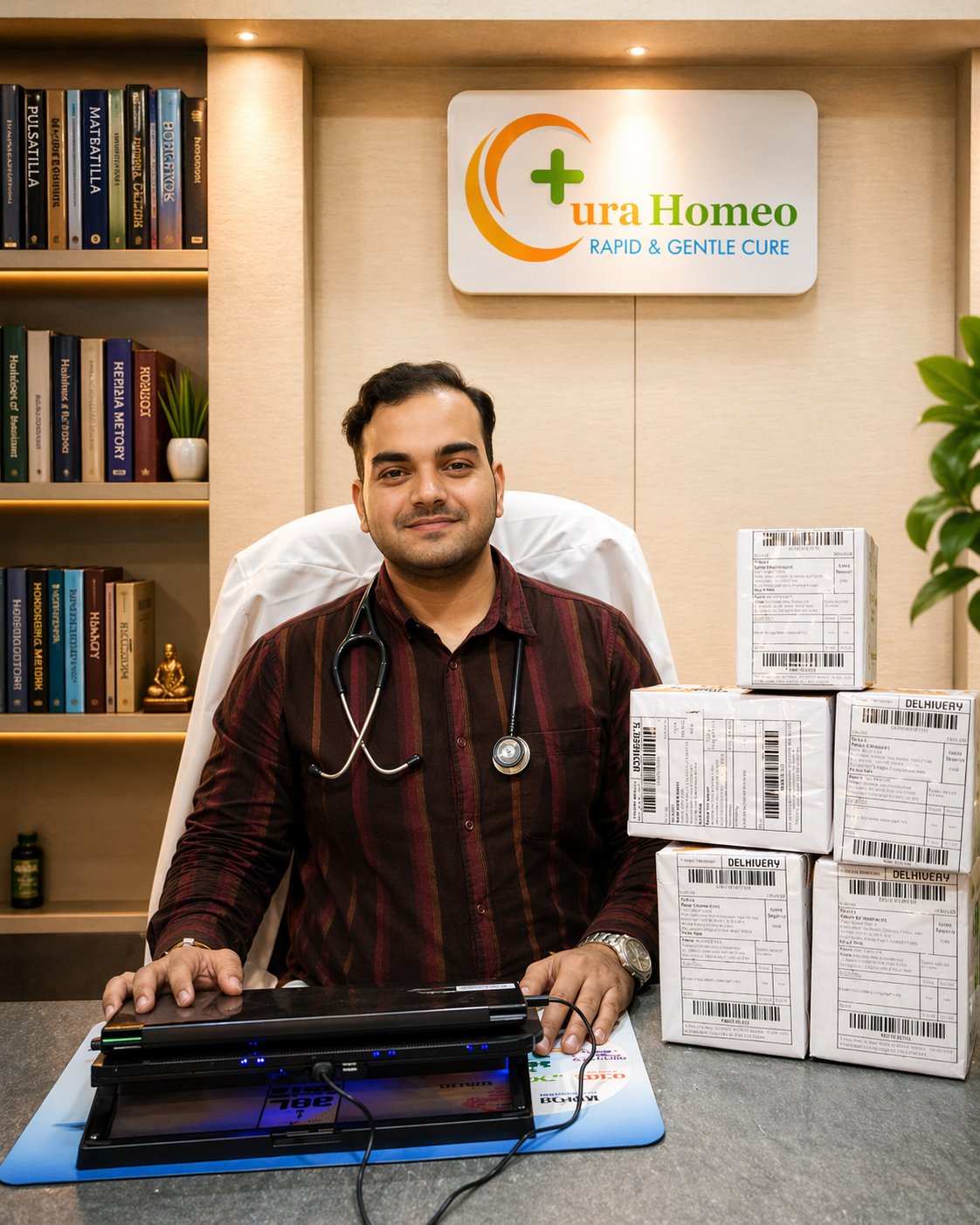
Dr. Prashant Mohan Singh
A clinician who understands both worlds: on one side, the profound depth of homeopathy, and on the other side, modern functional biochemistry, AI case analysis, and objective laboratory biomarkers.
Your identity with Dr. Prashant is not that of a "symptom customer," but that of an active partner in biological health restoration. In a focused 15–20 minute tele-discovery evaluation, your clinical history, reports, and stress patterns are systematically decoded.
THE COMPREHENSIVE MECHANISM
The 3-Front Attack Protocol
A synchronized tripartite framework designed to revive the human organism at the root level:
Mind: Vagus Nerve & Cortisol
Vagus nerve stimulation, autonomic tone mapping, and circadian cortisol stabilization to switch the nervous system out of chronic survival overdrive.
Meals: 6–8 PM Sunset Window
Anti-inflammatory nutritional blueprints, zero industrial seed oils, gut hyperpermeability restoration, and nocturnal cellular autophagy windows.
Medicines: Constitutional Potencies
Ultra-dilute constitutional dynamized potencies addressing genetic diathesis + concentrated mother tinctures for organ drainage + bio-chemic remineralization.
EVIDENCE-BACKED REVERSAL PROTOCOLS
Conditions We Treat
Explore individualized root-cause reversal frameworks for your diagnosis:
PCOS & hormonal concerns
View Protocol → •Thyroid conditions
View Protocol → •Chronic skin conditions
View Protocol → •Migraine & headaches
View Protocol → •Anxiety & stress
View Protocol → •Asthma & respiratory concerns
View Protocol → •Digestive concerns
View Protocol → •Joint pain & arthritis
View Protocol → •Allergies
View Protocol → •Hair & scalp concerns
View Protocol → •Fatty liver
View Protocol → •Male health
View Protocol → •Piles & fissures
View Protocol → •Spine & spondylosis
View Protocol → •Sleep concerns
View Protocol → •Autoimmune conditions
View Protocol → •Kidney health & CKD
View Protocol →OBJECTIVE DOCUMENTATION
The Evidence Vault
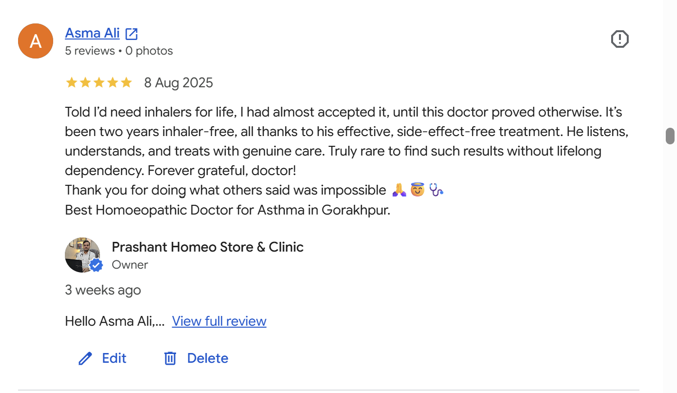
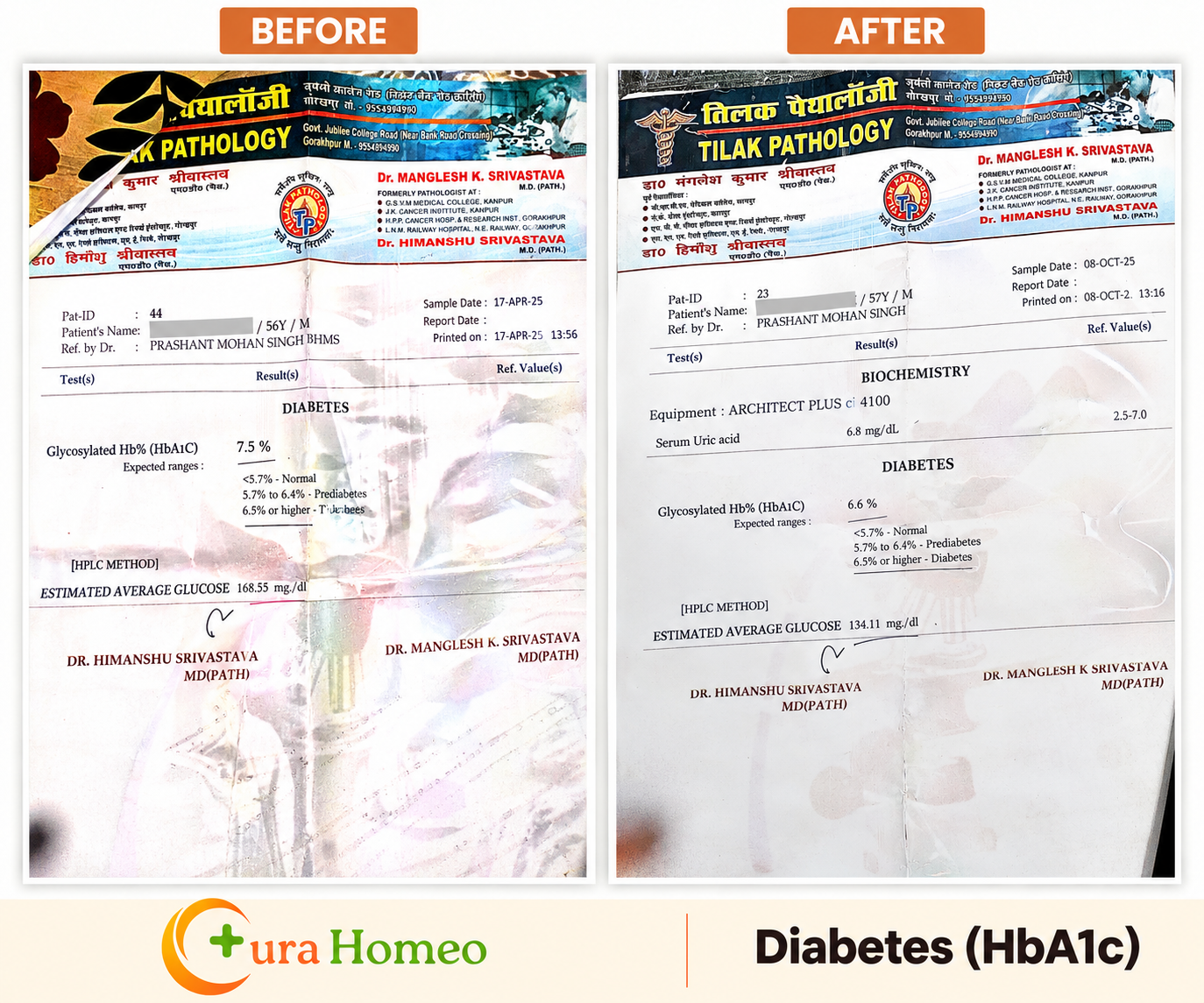
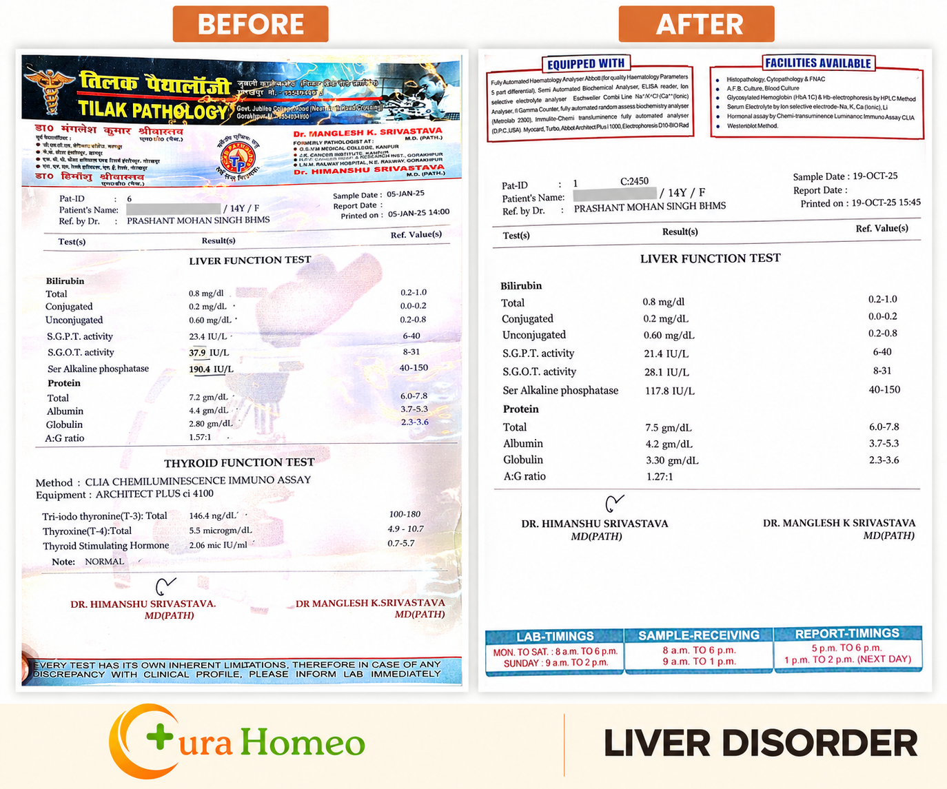
Original verified patient experiences and dated pre/post clinical diagnostic reports:




TRANSPARENT REVERSAL PLANS
Condition-Tiered Care Journey
Monthly structured care including doctor consultation, personalized CuraBox medicines, and 30-day monitoring:
Metabolic & Digestive
IBS, Acid Reflux/GERD, Insomnia & Sleep Reset, Mild Stress, Early Hair Fall.
Hormonal & Chronic
PCOS / PCOD, Thyroid Disorders, Chronic Migraine, Arthritis, Asthma & Respiratory Allergies.
Complex & Autoimmune
Severe Psoriasis, Eczema, Fatty Liver Grade 1/2, Autoimmune, Male Sexual Health, Spine Spondylosis.
"Confused? Don't Google. Consult."
Symptom searches give generic suppressors. Dr. Prashant Mohan Singh decodes your unique biological terrain through a focused 15–20 minute tele-discovery evaluation.